Using the user interface to the achieve the greatest learning effects.
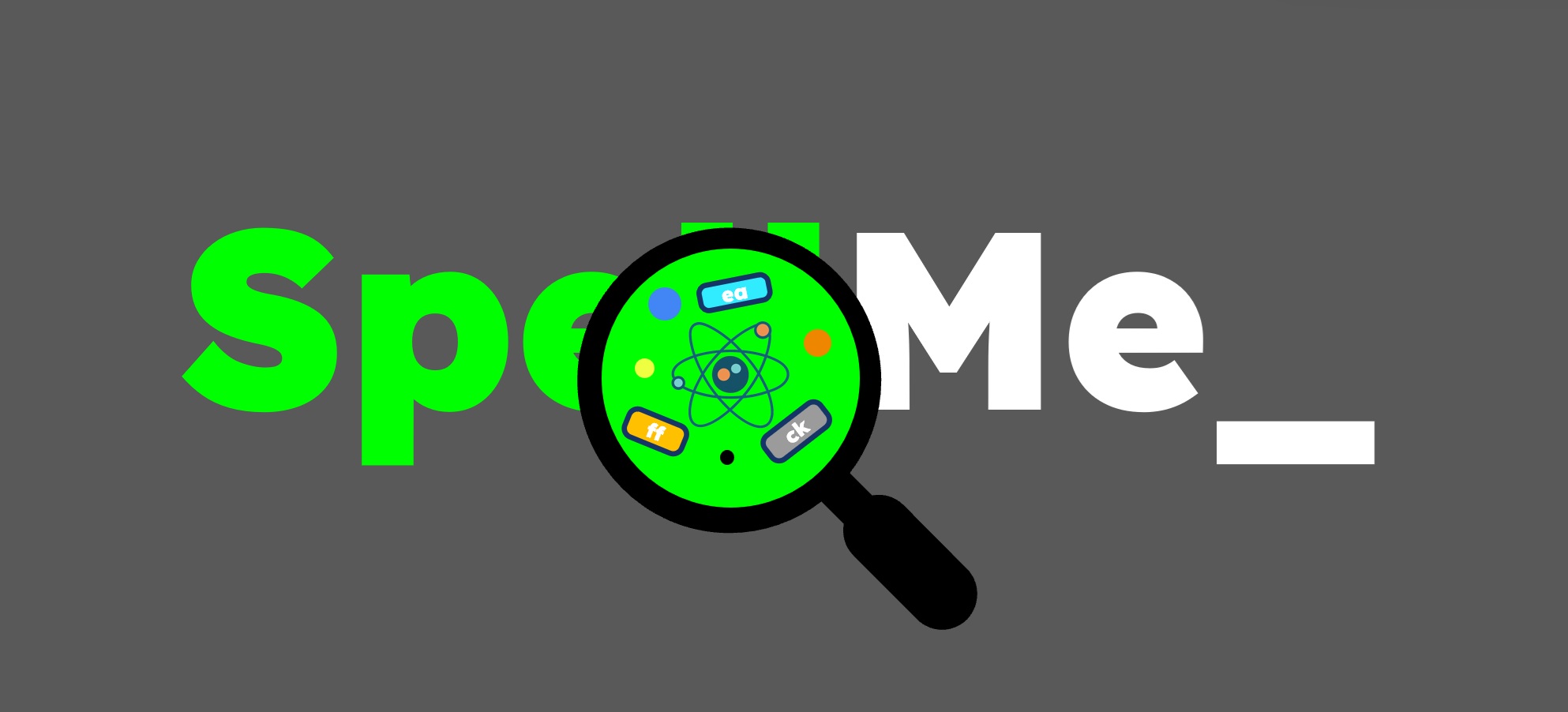
In Part 1, we looked at the foundations of reading and spelling instruction through phonics and structured literacy. We also discussed the research based justifications for using it in SpellMe. Many other spelling apps employ the same principles, but hardly any employ the UI features present in SpellMe, this is what sets it apart from the others.
The SpellMe UI has been carefully shaped by real-use most notably by my now eight-year-old son (the first employee of SpellMe Ltd 😛). Watching how he approached the app, where he struggled, and how he responded to errors directly influenced the design of the interface. The six features that follow grew out of this process, and each is grounded in research to help students understand and improve their spelling.
1.Encouraging persistence
Many existing spelling apps have a simple UI outcome. When the user spells a word wrong, it shows the correct answer and then moves to the next word. This does not allow the speller to understand where they went wrong, doesn’t give them an opportunity to put it right and ultimately wastes a valuable learning experience.
SpellMe takes a different approach, it does not allow the user to move on until the word is spelt correctly. This sounds a bit harsh, but there are special feedback methods employed that make this an easy process, which I will discuss below in 2. Coloured feedback and 3. Gradual hints and scaffolding. The main focus here is persistence and an opportunity to spell the word, even if it means they are copying the answer from the screen.
This simple design choice is based on evidence that errors are powerful learning opportunities. Metcalfe (2017) explains that “error-based learning” strengthens memory when students are required to correct their own mistakes. Kornell, Hays, and Bjork (2009) also found that even ‘unsuccessful retrieval attempts’ (aka getting it wrong) can enhance later recall. By making students persist, SpellMe helps build resilience as well as spelling knowledge.
2.Coloured feedback
The first of the feedback methods mentioned above is coloured feedback. If a word is spelt incorrectly, a representation of the student’s attempt is shown in green, orange, and red letters above. Green represents the correct letter in the right place, orange is the right letter in the wrong place, and red symbolizes a letter that does not exist. Dashes are also shown for missing letters at the end of the word. This gives students a clear picture of where they went wrong allowing them to improve at their next attempt.
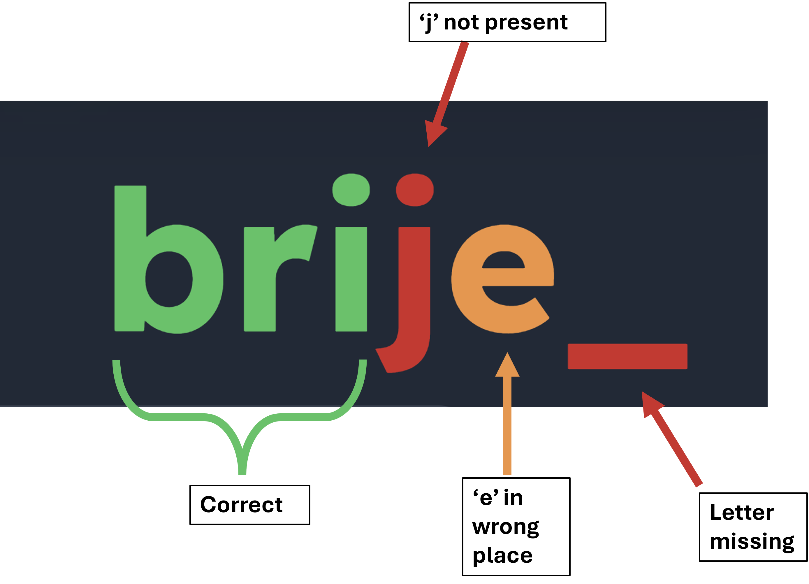
A student spelling 'bridge' as 'brije' would get this feedback
Research shows that feedback is most useful when it is immediate and specific (Shute, 2008). Ehri (2014) adds that paying attention to orthographic mapping (letter patterns) is essential in learning to recognise words. The coloured feedback connects these two strands: students see the exact points of error while also reinforcing letter-sound correspondences.
3. Gradual hints and scaffolding
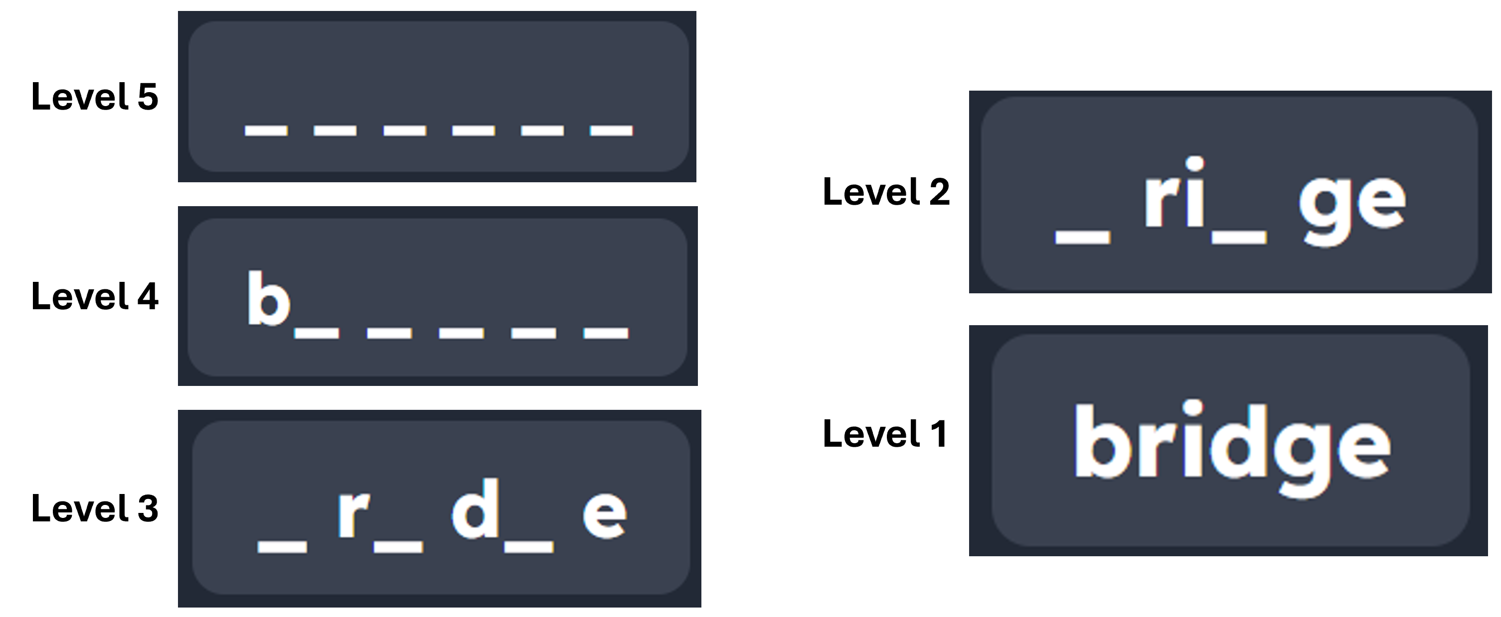
The second feedback method, mentioned above, helps to scaffold the learning experience. SpellMe doesn’t give all or nothing support. If a student struggles, the system reveals more of the word at different levels. There are 5 levels of word proficiency and feedback. Level 1 is the easiest level, where all letters are shown in the feedback hint. This is great for introducing new words to spellers. Level 5 is the most difficult level, where none of the letters are shown to the speller, only underscores which represent the letter. Students that are able to spell the word correct at this level have mastered the spelling of that word.
In Regular mode, the speller or teacher can pick the level the words are shown in. However, after 2 incorrect spellings, the hint level decreases by one before allowing the speller another opportunity. Consecutive wrong spellings cause the level to continue to decrease until level 1, when all letters are shown. The level the students get to before getting it correct is recorded and can be used in Mastery mode, which is discussed below.
This approach is rooted in Vygotsky’s (1978) idea of the zone of proximal development, where learners progress with the right amount of support. Pearson and Gallagher (1983) described this as a “gradual release of responsibility.” By offering different spelling levels, SpellMe makes sure students experience success while steadily moving toward independence.
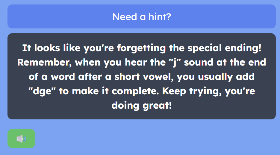
4. Smart hints based on error patterns
Smart hints is the third feedback method. SpellMe tracks the types of errors students make and provides tailored hints. For example, if a student regularly confuses “i” and “e,” the system can highlight that pattern. This is far more effective than generic advice. This is the only feedback method that is powered by AI, and can be very effective for students who don’t fully understand the focus of the structured literacy based SpellMe word lists.
Narciss (2008) shows that adaptive feedback leads to stronger learning gains, while VanLehn (2011) demonstrated that intelligent tutoring systems can approach the effectiveness of human tutoring when feedback is personalised.
5. Mastery mode
The SpellMe UI can act slightly differently depending on the mode that is used. Whereas regular mode goes through the word list once (default) or a user prescribed number of times, in mastery mode, the word list will continue to repeat until all the words are mastered. As discussed in 3. Gradual hints and scaffolding, each word has a success level, which is the hint/feedback level at which the word is spelt correctly. Mastery mode is only completed when all words in the word list are spelt correctly at level 5, which is when no letter hints are shown. All words start at level 1 (unless already visited) and increase in level when correctly spelt and reduce in level if incorrectly spelt. Words that are mastered within the list are removed, so that focus remains on difficult words. This repetition at ever increasing levels ensures that spellers fully understand how to spell.
Bloom’s (1968) research into mastery learning showed that requiring students to master material before moving forward can dramatically improve outcomes. Guskey (2010) later reinforced that the benefits of mastery extend beyond achievement, building confidence and persistence. In SpellMe, mastery mode helps to ensure that students consolidate spelling patterns before tackling harder lists.
6. Story mode - words in context
Finally, SpellMe includes a story mode, where the word list words are embedded in short, AI-generated stories. This connects spelling practice to reading comprehension and vocabulary growth. Bransford, Brown, and Cocking (2000) argue that students learn more effectively when knowledge is presented in context. Story mode also has the ability to personalize the story by the student or teacher adding their own words, and phrases, even the speller’s name to the story. Research shows that students engage more when they are embedded in personalized stories tailored to their own experiences (Miles, 2021). This aspect of personalization makes the learning experience that much more powerful. Story mode brings these ideas together, turning spelling into a richer literacy experience.
Conclusion
SpellMe’s design choices aren’t just about making the app look good or feel engaging. Each feature is rooted in solid research about how children learn to spell and read. By combining persistence, targeted feedback, scaffolding, adaptive hints, mastery, and contextual learning, SpellMe creates a structured pathway for students to succeed. This is what makes SpellMe different: it doesn’t just test spelling, it actively teaches it.
A look at how and why it works.
Introduction
As with all apps, there are many different parts that come together to make SpellMe. However, there are two main parts that are specially designed and focus on improving spelling capability for all students. The first is the main spelling UI, which I’ll cover in another post. The second, and focus of this piece, is the SpellMe Word list section. The word lists are specially curated to help students understand the mechanics of spelling words in the English language, and are based on the science of structured literacy.
Phonics
Let’s introduce the science of structured literacy by talking about Phonics first. This is probably the more familiar term for parents, home schoolers and teachers. It teaches how letters (graphemes) map to sounds (phonemes) and how those sounds blend into words. It’s a powerful method because it gives children the tools to decode unfamiliar words.
Structured Literacy and Structured Spelling
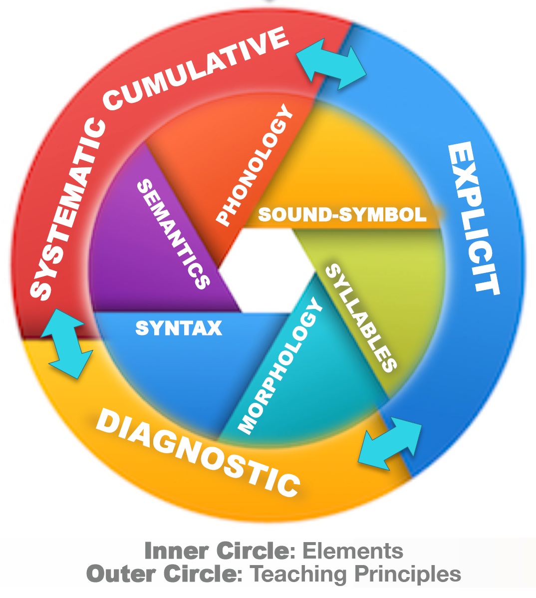
But phonics alone isn’t enough. Reading and spelling are more than just matching sounds to letters. Structured Literacy goes further. It covers six areas: phonology, sound–symbol associations, syllables, morphology, syntax, and semantics. Structured Spelling mirrors this, focusing on spelling rules, orthographic patterns, and how word origins shape English. Together, they form what’s known as the science of reading and spelling. This approach is systematic, explicit, and cumulative. Each new concept builds on the last.
Click for link to IDA website explanation.
Alternatives
Other methods have been popular but less effective. Whole language emphasises immersion and meaning, and is fine for a good number of students. However, for students that are not neurotypical, this approach has not been successful. Balanced literacy mixes approaches but often fails to provide the depth of phonics children need. Whole-word memorisation treats words as visual shapes, which doesn’t scale when vocabulary grows. The evidence, which we will talk about below, consistently shows that when we consider all students, neurotypical and neurodivergent, the structured approach yields better results.
Evidence for Structured Approaches
Let’s look at the history and evidence of structured literacy. This approach traces back to research done by Orton and Gillingham in the 1920s. Their work laid the foundation for multisensory, rule-based teaching that later became structured literacy. Decades of research confirm its effectiveness. Meta-analyses and national reviews show explicit, systematic instruction benefits all learners - not only those with dyslexia, but also typical readers.
-
Explicit spelling instruction boosts reading and writing - proven across 53 studies which included over 6000 K-12 students.
Source: Graham & Santangelo, 2014 -
Systematic phonics works best - confirmed by a US government review of 100,000+ studies.
Source: National Reading Panel, 2000 -
Systematic Phonics helps all learners - UK review shows benefits for both typical and struggling readers.
Source: Torgerson, Brooks & Hall, 2006 -
Structured Literacy benefits everyone - described as “essential for some, helpful for all, and harmful to none.”
Sources: LD Expert Blog, 2025; Savvas Insights, 2024; Reading Rockets, 2023 -
Nearly a century of research - Orton and Gillingham’s multisensory, rule-based approach still underpins modern practice.
Sources: Orton, 1925; Gillingham & Stillman, 1936
Using it in SpellMe
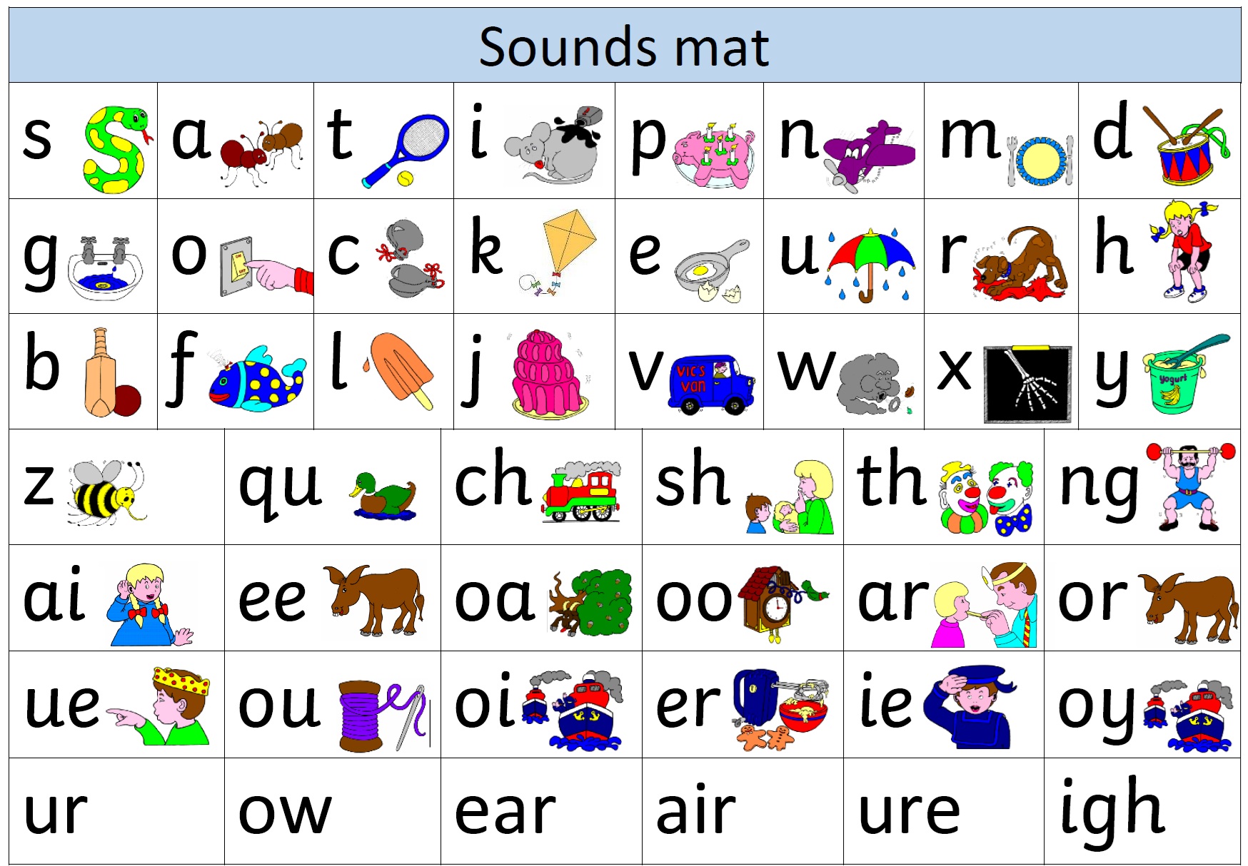
SpellMe’s word lists are built around the same principles. If you browse through the list, you will see headings like: short vowels, long vowels, digraphs, silent e patterns, suffixes, plurals, irregular words, and morphology. They’re sequenced to mirror the logical progressions found in structured approaches.
Having the spelling instruction through SpellMe run at the same time as whatever structured-literacy-based reading strategy you have will ensure parity and a more logical learning experience for students. So if a student is learning to read words with long i sounds, they can choose that word list for their level and spell long i sound words at the same time, to reinforce that learning.
This approach is not just for struggling students. It makes the whole learning experience meaningful and pleasant for all students.
A behind-the-scenes look at how SpellMe tackled cross-browser TTS challenges.
Intro
SpellMe’s text-to-speech function is one of the most important features of the app, and is central to how it works. It is one of the aspects I have probably spent most of my time on, as choosing the right voice (or voices) can mean the difference between effortless practice and sheer frustration. It is still a work in progress, but I have made some progress and have learned some things along the way. In this post, I’ll be sharing my experience.
Quality Trade-offs & Findings
Text-to-speech has made some huge improvements recently. In the past for apps like SpellMe, developers would have had to rely on audio recordings instead of machine generated speech. Due to the cost, time taken and restrictions of features that come with recorded audio, that is just not an option for a bootstrapped project like this one. However, the advancements of TTS have meant that audio recordings are no longer the only option or the best option around, with the current tech available. Let’s look at the current TTS landscape.
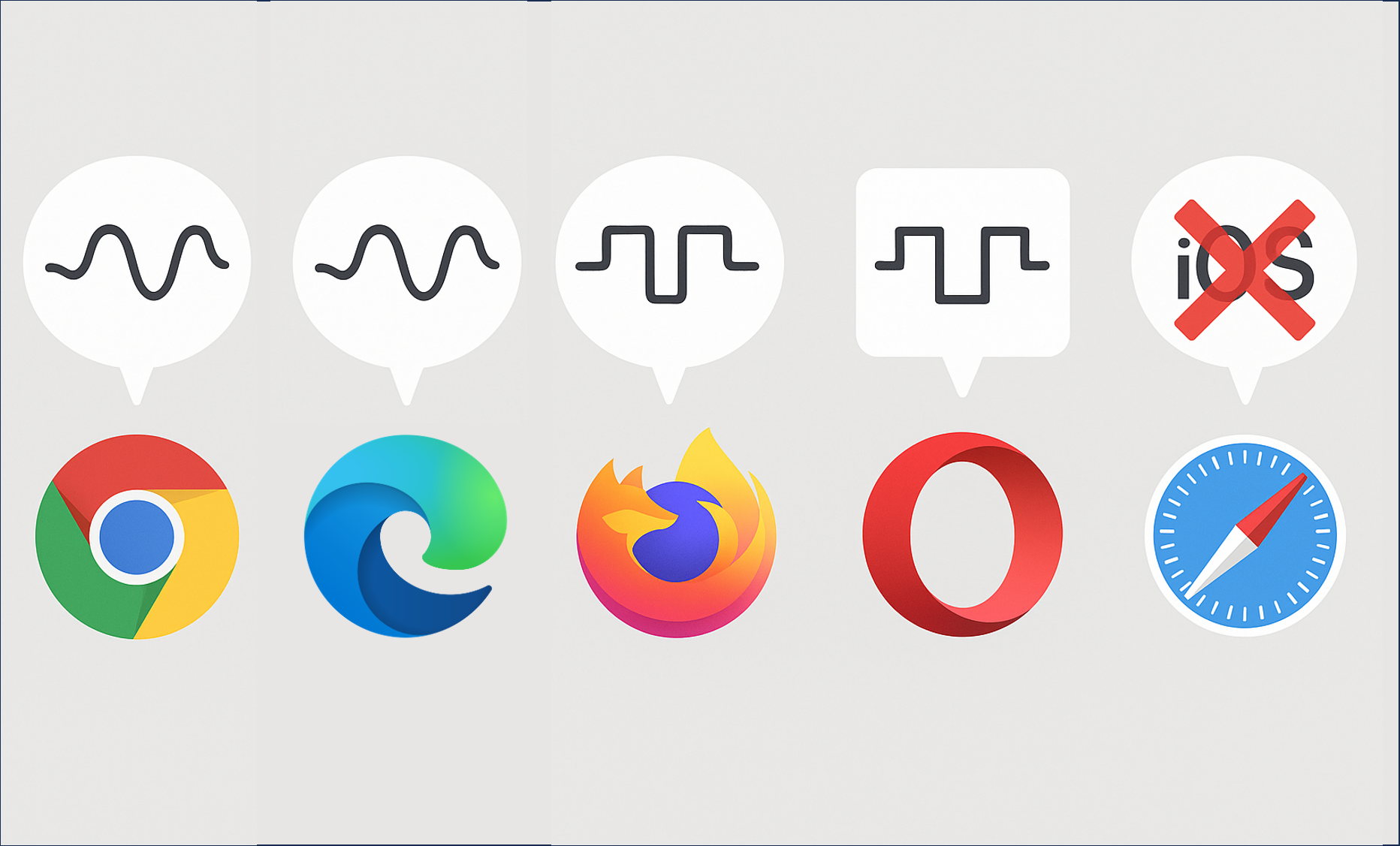
As SpellMe is a browser based app, browser based TTS was my initial port of call. However, quality varied immensely! In my tests, Chrome and surprisingly, Edge delivered the best in-browser voices—thanks to cloud-based “Standard” models like Google UK English Female, and Edge’s Microsoft’s Libby Online (Natural) voice, which were good enough for my use. I assumed that other chromium based browsers like Arc, Opera and Brave would have had access to similar, but no. They relied on the bog standard robotic voices that we all know and ‘love’. These are what SpellMe’s Alpha versions relied on before moving to Edge and Chrome. iOS more surprisingly, was among the worst. Voices like those used for Siri, just were not available through the browser, so iPads and iPhones reverted to those robotic like voices. These just were not good enough. So for all apart from Chrome and Edge, I turned to Google’s cloud based options, which essentially are the same as the ones available on the Chrome browser.
A Brief History of Browser TTS
Let’s pause briefly and delve into the history of browser based TTS voices, just to see what we’re playing with. Those robotic voices that most of the older tech generation are familiar with (similar to the voice of Stephen Hawking), are generated using formant & concatenative synthesis. This was developed for browsers in 2014. In 2018, we got the Standard cloud voices which are more current and sound nearly normal for the most part. However, around the same time, neural network generated voice type, WaveNet came onto the scene. This, along with the current generation (2020 to present) of Next-gen neural voices, used by companies like ElevenLabs, offering the best speech synthesis available today.
Formant and Concatenative Synthesis
Standard Cloud Voices
Wavenet/Neural Voices
SpellMe relies on the standard browser based cloud voices for Chrome and Edge, and then makes use of the non-browser based cloud standard versions for all other browsers—including iOS Safari.
The Chrome Profile Snag
The browser based voices that are available seem to be holding up for now. However, it has not always been like this, and I am strongly considering moving to solely non-browser based, cloud voices in future versions for a number of reasons. The first is consistency. Being able to rely on free browser based voice generation is valuable for SpellMe in its current iteration. The alternative would be to use a cloud based service for all voices, which would incur costs due to the increased use. However, the benefits of having consistency across all platforms is something that I would like SpellMe to strive for in the future. But, this is not even the main reason. General browser-based TTS has stability issues, which require careful coding of the speech synthesis engine to ensure smooth running. As well as this, a faulty Chrome profile or network policy can easily block access to the high quality cloud voices, leaving only the fallback robotic OS voices. Fixing or changing the profile can resolve those issues, but I would rather not have a solution that relies on specific actions from the end users, who may not have the technical know-how to deal with those issues.
iOS Gesture-Triggered Audio
And then there is iOS. In a previous comment I made, I mentioned that Safari for iOS was the new Internet Explorer! For those that used to do web development in the late 90s and early 00s, you may well remember this. Building a not too advanced website would, for the most part, work on Firefox, Netscape Navigator and whatever else happened to be around back then. The next stage would be taking time putting in IE hacks, so it would work like you wanted it to on the seemingly backwards browser from Bill Gates. This is one of the reasons why very few mourned the death of Windows’ first born browser. With Edge it was a case of ‘If you can’t beat them, join them’ when they finally went with a chromium engine for Edge in 2021. But it seems like Apple has taken up the mantle of annoying platforms to code for.
iOS seems to block non-user-initiated playback of audio. I can understand why, to a certain extent. It would be quite annoying for a user to not have control over some audio playing just out of the blue. However, none of the other browsers seem to have this issue. Due to the way SpellMe is coded, this has caused a considerable number of hours, just coding iOS hacks to get it to work on iPhones and iPads, which I imagine, would be the chosen devices of a considerable number of SpellMe users. Android, Windows and even MacOS had no such issues. Although I do hope to develop a native iOS (and Android) app, this will not be for some time. For now, my iOS woes are over, but I can imagine there may be more Internet Explorer type annoyances waiting to rear their ugly heads.
Looking Ahead: Alternative TTS Providers
As I’ve already mentioned, having platform based consistency will be an eventual goal. I think this would increase the quality of the service for students and teachers using SpellMe. But I would also like to consider increasing the quality past this if there are real benefits to be had. I will be conducting research into the likes of Azure Cognitive Services, AWS Polly Neural and ElevenLabs when I get the time and the funds to do that. So watch this space, as I try to balance voice quality, cost and browser quirks all at the same time. They very much seem to be a moving target, but so far I am having fun keeping up. Long may the fun continue.
The Ideal Op App: 6 Features for Creating the Best Literacy Learning App for Learners That Need More
Are modern edtech apps leaving neurodivergent learners behind? These 6 steps make sure more people are catered for.

This article is about the perfect features for literacy learning apps for ALL students, but I have hidden an engineering reference in the title that relates to the article. Hint: Infinite resistance. Drop a comment if you get it…Anyway, back to the show…
Considering students with learning difficulties like ADHD and dyslexia when creating learning resources is essential for ensuring all students have the opportunity to succeed in a classroom environment. Far too often, there are apps that fall short of the mark. This is why it was very important to me that when building SpellMe, these things were considered (Check out my first article to find out what SpellMe is and why I’m building it). In this article, I’ll explore the features that make learning apps more accessible for students with these and other neurodivergent challenges and how such features can be integrated into educational tools. These features, many of which are already in SpellMe, should be present in all literacy learning apps to be truly inclusive. Some of them, like adaptive learning and gamification are a no brainer, but many apps still fall short. I encourage developers of these apps to steal, borrow, share, and implement these ideas in your own work. BTW, each of the 6 points has links to further research at the bottom of this article, which are definitely worth checking out!
1. Personalized and Adaptive Learning
A core principle in any learning app is the ability to personalize the learning experience and adapt it to the student’s needs. For students with learning difficulties, this is crucial in keeping them engaged and ensuring that they progress without becoming overwhelmed.
Apps that offer adaptive learning algorithms can adjust the difficulty of tasks based on the student’s current performance. For example, if a student consistently struggles with certain words, the app can automatically lower the difficulty or provide additional hints, but at the same time make sure the student will eventually reach that more difficult level. This approach allows the student to progress at their own pace. This adaptability ensures that the student is always challenged, but never pushed beyond their capabilities.
Additionally, personalized learning paths that allow students to control their learning experience, such as choosing specific words for practice, can make the process more engaging and effective. This enables students to focus on areas they need improvement while ensuring that they are working at a pace that is comfortable for them, giving them more control over their learning journey.
2. Multisensory Accessibility and Cross-Device Compatibility
Multisensory learning is critical for students with dyslexia. By combining auditory, visual, and tactile inputs, apps can help reinforce the material in different ways, making it easier for dyslexic learners to process and retain information. For example, the use of high-quality text-to-speech (TTS) is essential for dyslexic learners to hear and internalize the words they are learning. Check out the link on the importance of TTS in dyslexia intervention below
However, it’s not just about multisensory elements. Accessibility should also extend to how an app works across different platforms. With technology becoming more ubiquitous, it’s crucial that learning apps work consistently across devices such as iOS, Android, Windows, and Mac. An ideal learning app should offer a uniform experience across these devices, ensuring that students can access high-quality features like TTS, success animations, and other multisensory cues, regardless of their device.
Providing consistent accessibility across platforms while maintaining high-quality, user-friendly features is no easy task, and I have the mental scars to prove it (a story for another day)! But it’s necessary for ensuring that all students can engage with the app, regardless of the device they use.
3. Gamification: Adding Motivation and Fun
Gamification can make learning fun and motivating, which is essential for students with ADHD, who often struggle with maintaining attention and engagement. Features such as scoring systems, leaderboards, and badges can transform learning into a challenge, encouraging students to improve their performance.
Including game-like elements, whether through points, levels, or rewards, keeps the learning process enjoyable and competitive. These features not only motivate students to perform their best but also create a sense of accomplishment and progression. Students are more likely to return to the app when they know they will be rewarded for their effort.
4. Dyslexia-Friendly Features: Font Choices for Better Readability
Creating dyslexia-friendly features is essential for improving readability and making the learning process more accessible for dyslexic students. For example, using Lexend or OpenDyslexic fonts, which are specifically designed to make reading easier for dyslexic learners, can reduce confusion and improve comprehension. My previous article delved into this topic in more detail.
Providing students with the ability to do things like customize the font type and colors allow them to create a learning environment that is optimal for their needs. By offering these customizable options, the app ensures that all learners can engage with the material in the most effective way for them.
5. Shorter Learning Sessions for Focused Engagement
For students with ADHD, long learning sessions can lead to frustration and disengagement. That’s why it’s important to break down learning into shorter, more manageable sessions.
For example, limiting wordlists to 10 words or less per session helps prevent students from feeling overwhelmed. Furthermore, features that allow students to save progress for longer lessons ensures that they can continue their learning at another time, without losing track of where they left off. This flexibility is essential for learners who may benefit from shorter bursts of focus, followed by breaks.
6. Phonics-Based Themes for Early Literacy
Phonics-based themes for spelling are essential for early literacy, particularly for students with dyslexia. Apps that integrate phonics-based themes, such as short and long vowel sounds, digraphs, and double letters, ensure that students practice key phonetic patterns not only when reading but when spelling, too.
These curated wordlists focus on fundamental literacy skills, which are especially beneficial for dyslexic students who often struggle with reading and word recognition. By practicing words based on recognized phonics principles, students can develop a stronger foundation for both spelling and reading.
Conclusion: The Road Ahead
All of the features discussed above are essential for creating accessible learning environments for students with ADHD, dyslexia, and other neurodivergent based learning difficulties.
These features are not only beneficial for students with learning difficulties, they enhance the experience for all learners. Many of these features are already present in SpellMe, such as personalized and adaptive learning through automatic level reduction for difficult words, multisensory features like high-quality TTS, success animations, and sounds, and dyslexia-friendly fonts throughout. In future versions, SpellMe will further incorporate game-based rewards, AI-powered personalized hints, and more analysis features to ensure that every student has the tools they need to succeed.
As I mentioned in the introduction, these ideas should be borrowed, shared, and incorporated into every literacy learning app, not just mine. They can help create better, more inclusive learning experiences.
So, who got the engineering reference? Drop me a comment. Also, check out SpellMe.app. I’d love to hear your thoughts!
Links to Research, as Promised:
1.Personalized and Adaptive Learning
Personalized Learning for Neurodivergent Students: What Works
Insighte. (n.d.). Personalized Learning for Neurodivergent Students: What Works. Retrieved from Insighte
2.Multisensory Accessibility and Cross-Device Compatibility
Effect of Text-to-Speech Software on Academic Achievement of Students with Dyslexia
Bhola, N. (2022). Effect of Text-to-Speech Software on Academic Achievement of Students with Dyslexia. Integrated Journal for Research in Arts and Humanities, 2(4), 51–55. Retrieved from Integrated Journal for Research in Arts and Humanities
3.Gamification: Adding Motivation and Fun
Developing Two Game-Based Interventions for Dyslexia: Therapeutic Interventions Using Gamification and Serious Games Approaches
Authors. (2022). Developing Two Game-Based Interventions for Dyslexia: Therapeutic Interventions Using Gamification and Serious Games Approaches. Entertainment Computing, 35, 100352. Retrieved from Entertainment Computing Journal
4.Dyslexia-Friendly Features: Font Choices for Better Readability
Lexend: Improving Readability for All
Lexend. (n.d.). Improving Readability for All. Retrieved from Lexend
5.Shorter Learning Sessions for Focused Engagement
Effective Strategies for Teaching and Supporting Students with ADHD
Enlightened Minds. (n.d.). Effective Strategies for Teaching and Supporting Students with ADHD. Retrieved from Enlightened Minds
6.Phonics-Based Spelling Themes for Early Literacy
Response to Phonics Through Spelling Intervention in Children with Dyslexia
Authors. (2019). Response to Phonics Through Spelling Intervention in Children with Dyslexia. Journal of Learning Disabilities. DOI: 10.1080/10573569.2019.1707732
I’ve learned that designing apps for Learning Means Caring About Fonts

I didn’t set out to care about fonts. I really didn’t. But somewhere along the road of building a spelling app for my son, I remembered something important from my classroom teaching days: some fonts help, and some fonts hurt - especially when you’re trying to help a kid read.
During my teacher training days, Comic Sans was all the craze in classrooms because it appealed to kids. But it quickly became one of the most hated and ridiculed fonts. I didn’t fully understand the backlash at first, but after a bit of research, I saw why: it was overused, popping up everywhere from corporate memos to CVs. It was inconsistently designed, and over time, it just became synonymous with being childish and unprofessional.
Ironically, Comic Sans was never designed for readability, but it turns out, it was quite readable for young and beginner readers. Unfortunately, by the time people started to realise that, its reputation was already beyond repair.
What Most Fonts Get Wrong (for Learning)
There are fonts out there that look great, clean, modern, sharp. You’ll see them on agency websites, minimalist landing pages, and design blogs. But try using those same fonts with a 7-year-old learning to spell, and you’ll hit a wall.
Many of the default fonts in popular design tools are too tightly spaced. They use high-contrast strokes or overly geometric shapes that make similar letters blur together. For confident adult readers, it’s barely noticeable. For a child still decoding letterforms? It’s a mess.
What the Good Fonts Do Differently
I started testing different fonts with my son, not just for style, but for clarity. That’s when I discovered Lexend, a font family specifically designed to improve reading fluency. It uses wider spacing, open shapes, and balanced proportions to reduce visual stress.
I tested it alongside other fonts, and despite my scepticism, Lexend was picked out by my son immediately. It was no contest. He found it easier to read, and that was all I needed to see.
I also tried Comic Neue, a refined version of Comic Sans (yes, really), which proved more readable than half the fonts I started with. It reminded me that sometimes the “uncool” fonts actually do the job better.
Why It Matters
This stuff isn’t cosmetic. It’s not about being on-brand. It’s about being readable, especially for the kids who need the most help. The ones who already feel behind. The ones for whom a single word can be the difference between confidence and giving up.
And it really does make a difference. When I was trying to get my son to read World of Reading Star Wars - The Battle of Endor - a story he absolutely loves, it would have been so much easier if it had been written in Lexend instead of whatever serifed font they used. There would have been far fewer tears.


Fonts matter. Letter spacing matters. Line height matters. If you’re building tools for young learners, learners with dyslexia, or just anyone who needs a little more patience from the screen - you need to care!
What I’m Using in SpellMe
Right now, SpellMe.app uses Lexend for the keyboard feature, and I will make sure that it spreads throughout the whole app. It’s clean, it’s accessible, and it makes the words feel calmer. That might sound odd, but once you see it in action, especially compared to more “standard” fonts like Times New Roman, you’ll get it. I also chose it because my son hand picked it as the most readable font when compared to others. To be honest, that was the deciding factor for me.
However, Lexend will not be the only font available. After posing the question on Reddit, it came to light that it would be best to have a choice of fonts. Even though I mentioned that the Serifed font of the Star Wars book my son was struggling to read brought tears to his eyes, it’s not like that for all readers, and not even readers that have learning disabilities. There are some fonts like the EasyReading typeface which is a hybrid font, using both serif and sans serif features.
All of this makes a difference. Let’s take the main picture for this article right at the top. It’s eye-opening.
For some readers, no matter what the word actually is, one font says: this is hard, and the other says: you’ve got this! Can you guess which one is which?
What’s Next
I’m still refining the UI, and fonts will continue to be part of that. Yes, it definitely has to look good. But it really has to work too, for as many beginner spellers and readers as possible. It has to be something that supports children instead of getting in their way.
If you’re building for learners, especially struggling learners, take another look at your fonts. Better yet, try reading your content at age 7, with half the confidence.
It might change everything.
If you’re interested, check out SpellMe.app for yourself. I’d love to hear your opinion.
Edit: Lexend use has now extended to the rest of the main app as well as the landing page, not just the keyboard anymore. Help docs and legals to come.